JQR’s Cover: An Incomplete History
JQR gets a facelift
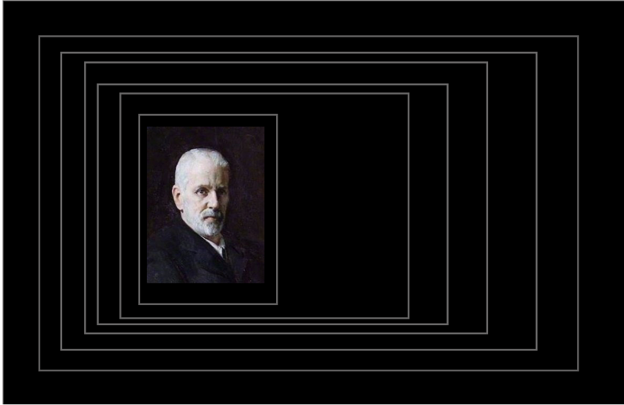
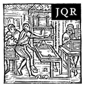
A detail from the cover of JQR 26.1 (1935)
To mark a new era, as well as twenty (!) years since David Myers, Elliott Horowitz, and I became the new editorial team, we decided the journal needed a new look. Being JQR, we did not go mad for change, but we have upgraded the design of all interior pages, built a new logo, embraced color, and—though physical paper journals are nearly relics already— designed a new cover for the print journal.
Both the new cover (for whose unveiling you will need to scroll to the end of this blog post…) and our new logo use a woodcut depicting an active printer’s shop taken from the title page of Isaac Abravanel’s Perush ha-Torah (Hanau, 1710).
But before we show you, here is a little tour of JQR covers of yore.
(the suspense!)
❦ ❦ ❦
 Twenty years ago, when I came on board, JQR was over a century old—a venerable institution. While its contents were fresh and formidable, the journal did little to mask its physical age. Generously, we might say that the cover communicated traditional seriousness. Less generously, it expressed aesthetic disinterest.
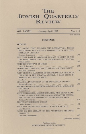
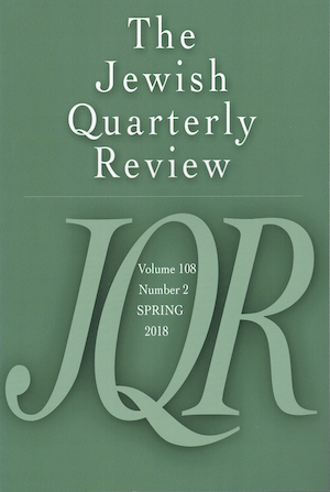
This issue, which appeared in 1992 under the editorship of David M. Goldenberg and Leon Nemoy, when JQR was published by the Annenberg Research Institute, features many household names (for those of us in the guild). The presence of female scholars tells us it is a late twentieth-century issue.
The cover was functional. It got the job done. And in fact, it is not devoid of conscious design choices, which become visible when you see the cover’s evolution.
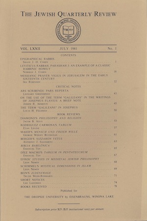
Go back a scant decade and find an earlier design. The title font is different, and this cover features the seal of JQR’s then home and publisher The Dropsie University. The masthead reveals that the journal at that time was edited by the entirety of the Dropsie faculty:
David Goldenberg, Leon Nemoy (who seems to have been first among equals), William Adler, Jacob B. Agus, Sol Cohen, Stephen A. Geller, Shimon L. Khayyat, Vera Moreen, Hayim Y. Sheynin, and Nahum Waldman.
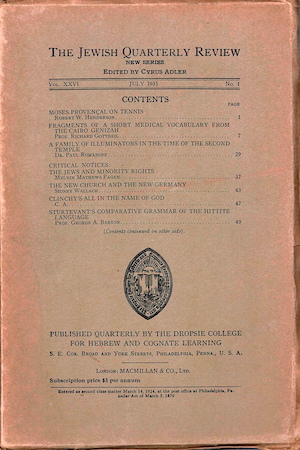
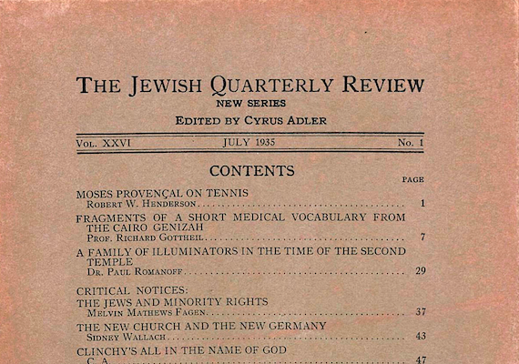
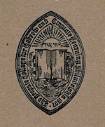
Let’s slip a bit further back, now to 1935 when the journal was published by The Dropsie College for Hebrew and Cognate Learning, printed in London by Macmillan & Co., Ltd., and edited by Cyrus Adler. The paper is now a darker brown, marked with an earlier iteration of Dropsie’s seal.
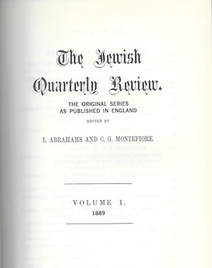
To the right you can see the cover page of JQR’s very first issue, of the old series. Published in London in 1989 and edited by Israel Abrahams and Claude Montefiore.
The arrival of Myers, Horowitz & Dohrmann in 2004 coincided with a move from Eisenbrauns to the University of Pennsylvania Press. We decided at that time to communicate the editorial change in part through a thorough redesign—and since then, the journal has looked like this.
In tune with the times, to be sure, but all styles pass out of fashion. Perhaps early JQR was onto something with its unassuming, timeless brown paper covers.
And so we arrive at this moment.
JQR’s new cover! (Here you can see all four covers, one color per season.)
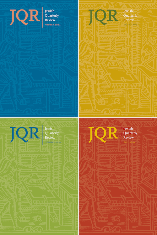
JQR 114.1 (winter 2024), now with editors Dohrmann, Myers, and Albert, marks the first issue with the new cover as well as new typeface and layout inside, designed by the talented Sue Hall.
Read more about the design choices over at the Penn Press Blog.
Same great content as ever, with a fresh new face.
May we live to see this become dated as well.
Here’s to another century of:
About the Author